how to make remove text with animation from navbar
Hello I want to make this navbar for phones which will cut out the text when the user scrolls down but I'm very confused on how can I do it because if I just move navbar up it will start cutting out my images first can some one give me a clue on how can I solve this problem here is my code (note I use tailwindcss)
Code:
<script>
    //checks if on phone
    let onPhone;
    function checkIfOnPhone() {
        let width = window.innerWidth > 0 ? window.innerWidth : screen.width;
        if (width < 426) {
            onPhone = true;
        } else {
            onPhone = false;
        }
    }
    checkIfOnPhone();
    addEventListener("resize", checkIfOnPhone);
    //user scroling page
    let phoneNavbarFull;
    document.addEventListener("scroll", scrollListener);
    let topPxSize;
    let scrollTop;
    function scrollListener() {
        scrollTop =
            window.pageYOffset ||
            (
                document.documentElement ||
                document.body.parentNode ||
                document.body
            ).scrollTop;

        if (onPhone && scrollTop < 20) {
            topPxSize = -scrollTop + "px";
        } else {
            topPxSize = "-20px";
        }
        console.log(scrollTop);
    }
    scrollListener();
</script>

<main>
    {#if onPhone}
        <nav class="navbar-background" style="--topPxSize: {topPxSize}">
            <div class="navbar">
                <ul class="flex justify-between">
                    <li />
                    <li>
                        <button class="flex flex-col items-center">
                            <img src="./imgs/Home_light.svg" alt="Home" />
                            <p class="nav-btn-mobile">Home</p>
                        </button>
                    </li>

                    <li>
                        <button class="flex flex-col items-center"
                            ><img
                                src="./imgs/Desk_alt_light.svg"
                                alt="Portfolio"
                            />
                            <p class="nav-btn-mobile">Portfolio</p></button
                        >
                    </li>
                    <li>
                        <button class="flex flex-col items-center"
                            ><img src="./imgs/Phone_light.svg" alt="Contact" />
                            <p class="nav-btn-mobile">Contact</p></button
                        >
                    </li>

                    <li />
                </ul>
            </div>
        </nav>
        <div class="pb-60 mb-60" />
    {:else}
        <nav class="navbar-background">
            <ul class="flex justify-between">
                <li class="nav-btn"><span class="font-bold">LAY</span>CODE</li>
                <ul class="flex">
                    <li class="nav-btn">Home</li>
                    <li class="nav-btn">Portfolio</li>
                    <li class="nav-btn">Contact</li>
                </ul>
            </ul>
        </nav>
    {/if}
</main>

<style lang="postcss" global>
    @tailwind base;
    @tailwind components;
    @tailwind utilities;

    @layer utilities {
        .navbar {
            position: fixed;
            top: 0;
            width: 100%;
            z-index: 100;
        }
        .navbar-background {
            background-color: #000;
            position: fixed;
            top: var(--topPxSize);
            width: 100%;
            height: 45px;
            z-index: 100;
        }
        .nav-btn {
            @apply text-white mr-6;
        }
        .nav-btn-mobile {
            @apply text-white text-sm text-center;
        }
    }
</style>
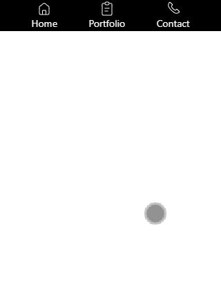
and here is how it should look more or less.
from Recent Questions - Stack Overflow https://ift.tt/316tDc3
https://ift.tt/3HWOhfL

Comments
Post a Comment