Add a gradient background line to the circle
I have a block on the page where there is a background line, on the line itself there is a circle that scrolls along with the main scroll
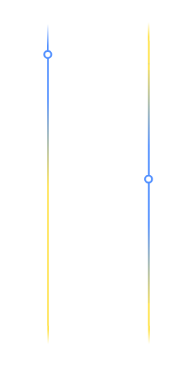
The question is, how can you make it so that, along with the circle, another line of the same color as the circle scrolls along the line, and it all would look something like this:
I tried adding styles to before, but it didn't work out what I expected
left: 50%;
transform: translate(-50%, -50%);
width: 3px;
height: 40vh;
background: #4f8eff;
box-shadow: inset 0 20vh 10vh -10vh #f6e75e, inset 0 -20vh 10vh -10vh #f6e75e;
z-index: 2;
Everything should be like in the picture that I threw off, the circle should be white inside, and the blue color should completely overlap the yellow when we scrolled to the very top, and the same from the bottom. And in the center of the block, let's say the blue color should be both above the circle and below, while maintaining the gradient
const circle = document.querySelector(".circle");
const cases = document.querySelectorAll(".case");

circle.style.transition = ""

const handleScroll = () => {
  const {
    height: blockHeight
  } = document.querySelector(".block2").getBoundingClientRect()

  const maxTop = cases[cases.length - 1].offsetTop + cases[cases.length - 1].offsetHeight - 200
  const minTop = cases[0].offsetTop

  let {
    height: startTop
  } = cases[0].getBoundingClientRect()

  const scrollDist = Math.min(maxTop, Math.max(startTop / 2 + window.scrollY, minTop))

  circle.style.top = `${scrollDist}px`
  circle.style.backgroundSize = `17px ${blockHeight}px`
  circle.style.backgroundPosition = `0 ${-scrollDist}px`
}

const handleWindowSizeAndScroll = () => {
  window.removeEventListener("scroll", handleScroll)
  window.removeEventListener("resize", handleScroll)
  window.addEventListener("scroll", handleScroll)
  window.addEventListener("resize", handleScroll)
}

handleScroll()
handleWindowSizeAndScroll()
window.addEventListener("resize", handleWindowSizeAndScroll)
.block1 {
height: 200px;
background-color: gray;
}
.block3 {
height: 600px;
background-color: gray;
}
.block2 {
height: 100%;
position: relative;
}
.block2,
.block2 .circle {
background: linear-gradient(214deg, rgba(79, 142, 255, 0) 0%, #f5e550 10%, #f5e550 90%, rgba(79, 142, 255, 0) 100%) center/3px calc(100% - 100px) no-repeat;
}
.block2 .circle {
background: #4f8eff;
width: 17px;
height: 17px;
left: 50%;
transform: translate(-50%, -50%);
}
.block2 .circle,
.block2 .circle::before {
position: absolute;
border-radius: 50%;
}
.block2 .circle::before {
content: "";
inset: 3px;
background-color: white;
}
.block2 .circle::before {
left: 50%;
transform: translate(-50%, -50%);
width: 3px;
height: 40vh;
background: #4f8eff;
box-shadow: inset 0 20vh 10vh -10vh #f6e75e, inset 0 -20vh 10vh -10vh #f6e75e;
z-index: 2;
}
.text {
text-align: center;
padding: 200px 50px;
}<link rel="stylesheet" href="https://cdnjs.cloudflare.com/ajax/libs/bootstrap/5.3.0/css/bootstrap.min.css" integrity="sha512-t4GWSVZO1eC8BM339Xd7Uphw5s17a86tIZIj8qRxhnKub6WoyhnrxeCIMeAqBPgdZGlCcG2PrZjMc+Wr78+5Xg==" crossorigin="anonymous" referrerpolicy="no-referrer"
/>
<div class="block1"></div>
<div class="block2">
<div class="circle"></div>
<div class="case">
<div class="row">
<div class="col-5 text">Text 1</div>
<div class="col-2"></div>
<div class="col-5 text">Text 1</div>
</div>
</div>
<div class="case">
<div class="row">
<div class="col-5 text">Text 2</div>
<div class="col-2"></div>
<div class="col-5 text">Text 2</div>
</div>
</div>
<div class="case">
<div class="row">
<div class="col-5 text">Text 3</div>
<div class="col-2"></div>
<div class="col-5 text">Text 3</div>
</div>
</div>
</div>
<div class="block3"></div>
Comments
Post a Comment