Overflow properties working differently on a div inside and outside a CSS grid
I have the following structure, which I will call 'list of files' (using Bootstrap 4):
.file-component {
  border: 1px solid red;
}

.file-component .file-name {
  overflow: hidden;
  text-overflow: ellipsis;
  white-space: nowrap;
}
<link href="https://maxcdn.bootstrapcdn.com/bootstrap/4.0.0/css/bootstrap.min.css" rel="stylesheet"/>
<div class="row">
<div class="col-sm-12 col-md-6 col-lg-4">
<div class="file-component">
<p class="file-name">Some long file name inside the grid that really does not fit inside the available space</p>
</div>
</div>
<div class="col-sm-12 col-md-6 col-lg-4">
<div class="file-component">
<p class="file-name">Some long file name inside the grid that really does not fit inside the available space</p>
</div>
</div>
<div class="col-sm-12 col-md-6 col-lg-4">
<div class="file-component">
<p class="file-name">Some long file name inside the grid that really does not fit inside the available space</p>
</div>
</div>
<div class="col-sm-12 col-md-6 col-lg-4">
<div class="file-component">
<p class="file-name">Some long file name inside the grid that really does not fit inside the available space</p>
</div>
</div>
</div>Each file component in this 'list of files' is composed of a p tag inside a div1. To make things responsive, the div should have a length that is determined by the bootstrap grid classes col-sm-12 col-md-6 col-lg-4, depending on the size of the screen. At certain breakpoints, the items in the divs occupy a different number of columns, until they are eventually stacked on top of each other. At all times, the p tag should fit inside the div width, cutting off any text that falls outside the div.
For example, if the text is short (or the div is wide enough), it is all visible:

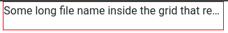
But, if it is long (or the div is narrow), we get:
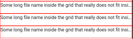
Now, this works pretty well as it is. For a wide screen:

And for a really narrow screen:
The problem appears when I try to put all this inside a CSS grid layout:
.file-component {
  border: 1px solid red;
}

.file-component .file-name {
  overflow: hidden;
  text-overflow: ellipsis;
  white-space: nowrap;
}

.grid-container-component .grid-central-container {
  grid-area: cnt;
  border-left: solid 2px;
  border-right: solid 2px;
}

/* Medium sized screens (900px < width < 1400px) */
.grid-container-component {
  display: grid;
  border: solid 2px;
  grid-template-columns: 1fr 7fr 1fr;
  grid-template-rows: 1fr;
  grid-template-areas: "lt cnt rt";
  margin-top: 30px;
}

/* Wide screens (> 1400px wide) */
@media (min-width: 1400px) {
  .grid-container-component {
    grid-template-columns: 1fr 5fr 1fr;
    grid-template-areas: "lt cnt rt";
  }
}

/* Small Screens (< 900px wide) */
@media (max-width: 900px) {
  .grid-container-component {
    grid-template-columns: 1fr;
    grid-template-areas: "cnt";
  }
}
<link href="https://maxcdn.bootstrapcdn.com/bootstrap/4.0.0/css/bootstrap.min.css" rel="stylesheet"/>
<div class="grid-container-component">
<div class="grid-central-container">
<div class="row">
<div class="col-sm-12 col-md-6 col-lg-4">
<div class="file-component">
<p class="file-name">Some long file name inside the grid that really does not fit inside the available space</p>
</div>
</div>
<div class="col-sm-12 col-md-6 col-lg-4">
<div class="file-component">
<p class="file-name">Some long file name inside the grid that really does not fit inside the available space</p>
</div>
</div>
<div class="col-sm-12 col-md-6 col-lg-4">
<div class="file-component">
<p class="file-name">Some long file name inside the grid that really does not fit inside the available space</p>
</div>
</div>
<div class="col-sm-12 col-md-6 col-lg-4">
<div class="file-component">
<p class="file-name">Some long file name inside the grid that really does not fit inside the available space</p>
</div>
</div>
</div>
</div>
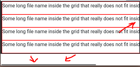
</div>When the screen is wide, all works as expected. For example (CSS grid is shown in black):

However, for very narrow screens, it seem the p tag does not let the div.file-component become shorter than the text it contains. Therefore, the div.file-component overflows on the right of the grid and a horizontal scroll bar appears on the bottom:
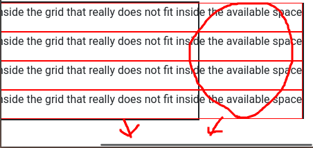
The four lower file components are outside the grid, and behaving as expected, to see the comparison. Any idea why this could be happening?? Any alternative ways of doing this are welcome too!
1In reality there are more things inside this div, but for the simple example this is good enough.

Comments
Post a Comment